Quick answer: what this article covers and who it's for
Minimalist UI: How We Design High-End Dark Interfaces for SaaS Founders — answered concisely: we use deep, desaturated dark bases (not pure black), glassmorphism for layered depth, a strict visual grid, disciplined accent use (60-30-10), and micro-interactions to create premium, usable SaaS products. This guide is for SaaS founders, product designers, and engineering leads who need a practical checklist and implementation roadmap to ship a high-end dark interface.
TL;DR
Use charcoal tones instead of pure black, add frosted glass layers with subtle borders and backdrop blur, keep one strong accent (10%) for CTA and active states, enforce an 8px grid and typed design tokens, and build with modern frameworks like React + TypeScript or Next.js while optimizing for Core Web Vitals and accessibility. Below are the principles, a practical workflow, an implementation checklist, risks and mitigations, and next steps.
Why choose a minimalist dark UI for SaaS?
Dark, minimalist interfaces communicate focus and premium quality when executed with discipline. They reduce visual noise, highlight key actions, and can make data-dense dashboards feel calmer. For SaaS founders, a well-crafted dark UI can improve perceived value, increase attention on conversion elements, and provide a distinct brand personality — while still needing careful attention to accessibility, performance, and maintainability.
1. The Dark Base: ditch pure black
Pure black (#000000) for backgrounds and pure white (#FFFFFF) for text creates harsh contrast and a flat, high-contrast look that strains the eyes. Instead, prefer deep charcoal and slate tones. Example palette choices to start from:
- Base background: #050505 or #0D0E12 — deep, slightly saturated charcoal.
- Card surfaces: #121318 or #1A1C23 — soft grey-blue panels for layering.
- Borders: rgba(255,255,255,0.08) — fine, light-reflective edges to define sheets.
These tones create soft depth and make shadows, overlays, and glass effects readable without eye strain.
2. Glassmorphism: creating layered depth
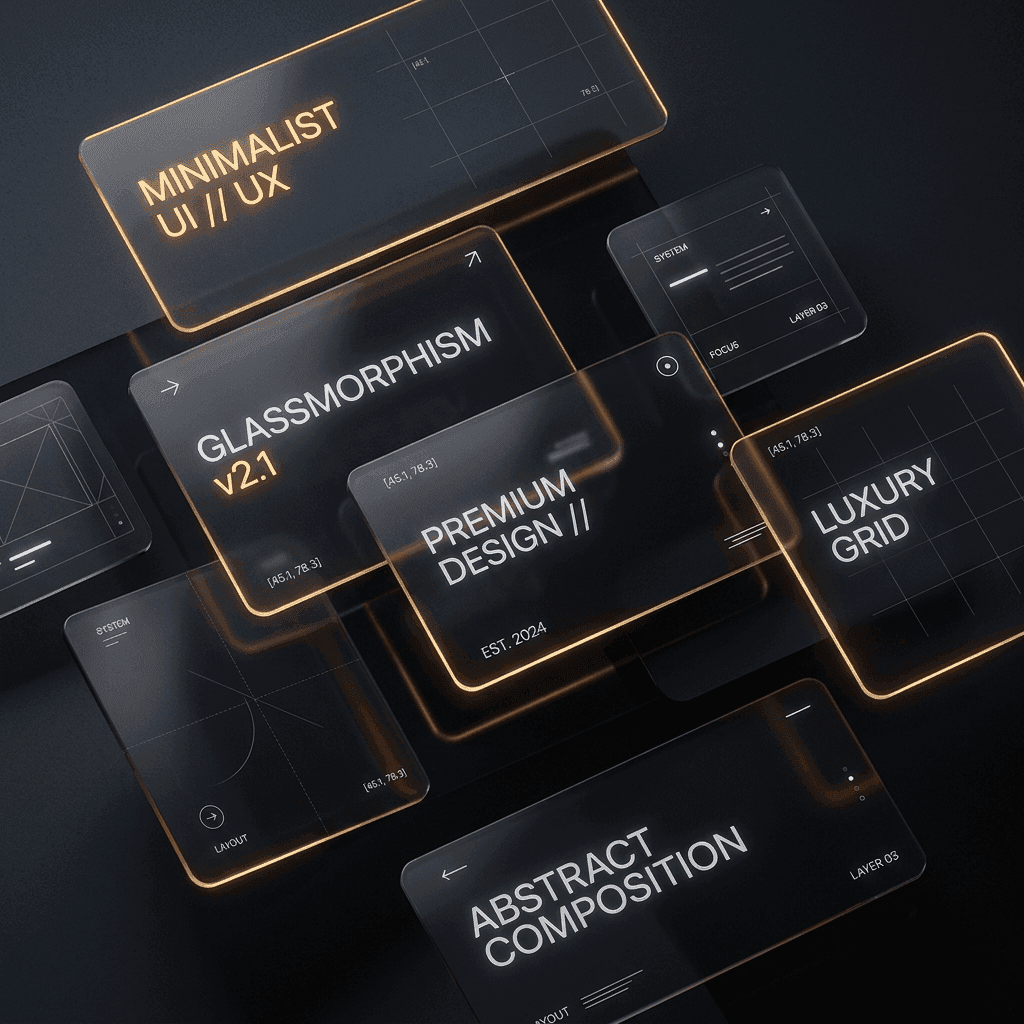
Glassmorphism is about implying physical materials: translucent sheets, subtle blur, and delicate borders. For dark themes, this approach elevates panels without adding clutter. Key styling rules to follow:
- Backdrop blur: use a modest blur for underlying content so layers feel separated but legible. Test across devices — heavy backdrop filters can be expensive on some GPUs.
- Frosted tint: apply a faint white or desaturated tint (very low opacity) to the card background so content remains readable on dark bases.
- Light-reflective borders: add a thin, low-opacity border to simulate glass edges and give panels a crisp silhouette.
3. The Golden Accent Rule: 60-30-10
Discipline with color preserves the premium effect. Apply the 60-30-10 rule:
- 60% Dominant: deep dark base (background).
- 30% Secondary: greys, muted text colors, soft separators.
- 10% Accent: a single bright hue (warm gold, electric cyan, or deep amber) used sparingly for primary CTAs, important states, and small highlights.
Limit accent variations, and avoid using multiple bright colors on the same screen. Use opacity and desaturation to tune emphasis.
4. Visual grid and layout hierarchy
Use a mathematical grid (we prefer an 8px system) for spacing, typography scales, and component dimensions. A predictable rhythm ensures visual balance and faster development. Combine spacing tokens with responsive breakpoints and a clear hierarchy for headings, body copy, and microcopy.
5. Micro-interactions and motion
Micro-interactions give interfaces personality and feedback. Keep animations short (< 300ms) and use natural easing. Provide reduced-motion alternatives for accessibility and avoid heavy motion that competes with content.
Design workflow: from discovery to handoff (practical example)
Example project: redesigning a SaaS analytics dashboard into a high-end dark interface.
- Discovery: map user journeys, prioritize flows (onboarding, core task, conversion), and define measurable goals.
- Exploration: create three visual directions — charcoal minimal, warm dark, and neutral dark — and validate with stakeholders.
- Components & Design System: define tokens for color, spacing, elevation, and typography. Build key components (cards, modals, nav, data tables).
- Prototype & Test: interactive prototype for primary flows; run quick usability sessions focusing on contrast, focus order, and micro-interactions.
- Engineering Handoff: export design tokens (JSON), annotated Figma files, accessible color contrast specs, and Storybook-ready component examples.
- Iterate: implement in small increments, validate performance and accessibility, then polish before launch.
Implementation checklist: tools, frameworks and handoff
- Design: Figma with shared design tokens, exported component specs, and a style guide.
- Front-end stack: React with TypeScript; commonly paired with Next.js for server-side rendering and SEO-sensitive pages.
- Styling: CSS variables, utility frameworks (Tailwind) or CSS-in-JS; set up theme tokens for easy dark/light toggling.
- Component library: Storybook or similar for isolated UI components and visual tests.
- Accessibility: automated checks plus manual keyboard and screen reader testing; document focus states and reduced-motion behavior.
- Performance: SSR/SSG when appropriate, image optimization, lazy loading, and careful use of backdrop-filter to avoid jank.
- Handoff deliverables: token JSON, responsive specs, annotated Figma, Storybook link, and acceptance criteria for each component.
Security, performance and Core Web Vitals considerations
Dark UI is a visual layer; underlying engineering must still meet security and performance requirements:
- Security: enforce standard SaaS practices — secure authentication, proper session management, and least-privilege APIs. The UI should never imply security guarantees without backend controls.
- Performance: avoid overusing backdrop-filter and complex multi-layer shadows that can cause repaints. Prefer composited transforms and GPU-safe effects.
- Core Web Vitals: prioritize fast first contentful paint and interaction readiness. Use server rendering or pre-rendered content for initial load, optimize fonts and images, and monitor field metrics post-launch.
Costs, timeline and maintenance considerations
Cost and time depend on scope, complexity, and whether you already have a design system. Factors that affect estimate:
- Number of unique screens and interactive states.
- Data complexity (tables, charts, realtime updates).
- Accessibility and localization requirements.
- Integration complexity with your backend and APIs.
Plan for ongoing maintenance: component updates, accessibility fixes, and performance tuning as product usage grows. For MVP projects, focus on a limited component set and extend the design system iteratively.
Limitations and risks of dark minimalist UIs
Dark themes bring trade-offs. Be aware of:
- Accessibility: lower-luminance palettes can reduce readability for some users; always verify contrast ratios and provide a light-mode alternative.
- Perceived legibility: thin, low-contrast text or small font sizes hurt readability — especially on mobile.
- Performance: glassmorphism and heavy effects may tax older devices; offer performance-friendly fallbacks.
- Brand fit: dark, minimalist visuals may not suit all audiences; validate with users early.
Case example: redesign workflow (no client metrics claimed)
Step-by-step for a hypothetical pricing & billing dashboard:
- Create a compact, data-first layout using an 8px grid, reducing vertical clutter while keeping key numbers prominent.
- Introduce a frosted header card to surface current plan and CTA, using a warm gold accent for the primary action (10% color use).
- Build table rows as elevated glass cards with subtle hover lift and an accessible focus state for keyboard users.
- Deliver tokens and Storybook components to engineering, then test performance on representative devices and adjust effects.
How Wizora can help — services and next steps
If you want help turning these principles into a product, we offer end-to-end design and engineering for SaaS. Relevant services include:
- UI/UX design — visual systems, prototypes, and accessibility audits.
- Web development — React, TypeScript, and scalable architecture for production.
- MVP and SaaS development — focused builds for early-stage products.
See examples of our work on the work page or contact us to discuss a design audit or project brief.
FAQs
How does minimalist UI design work for SaaS founders?
Minimalist UI removes non-essential elements to spotlight core tasks and metrics. For founders, this means clearer funnels, reduced cognitive load for users, and a visual language that emphasizes value — provided the design is validated for usability and accessibility.
What are the benefits of high-end dark interfaces?
They create a premium look, reduce glare for content-focused screens, and make bright accents pop. The benefits are realized when contrast, legibility, and responsiveness are carefully balanced.
How do you implement a minimalist dark UI?
Start with discovery and a limited component set, define design tokens, build accessible components in React/TypeScript, and iterate with performance testing (including Core Web Vitals). Use an incremental handoff with Storybook and token exports.
Is pure black good for dark UI?
Generally no. Pure black increases contrast and visual fatigue. Prefer deep charcoals with slight saturation to create depth and reduce strain.
How do you apply glassmorphism in a SaaS UI?
Use subtle backdrop blur, low-opacity frosted tints, and thin reflective borders. Always test performance and provide fallbacks for devices that struggle with heavy compositing.
Author
Wizora Studio Design Team — Last updated: 2026-08-26