The Psychology of Color and Typography in Premium Branding for Tech Startups
Quick answer: The Psychology of Color and Typography in Premium Branding for Tech Startups is about using strategic color palettes, contrast, and typographic voice to communicate trust, competence, and craft instantly—especially important for founders and investors who make split-second credibility judgments. This article is for product teams, founders, and UI/UX designers who need a practical guide to create a premium visual identity that performs across web, app, and marketing touchpoints.
Why color matters for premium branding (overview of color psychology)
Color is a fast, nonverbal signal. In premium tech branding, color choices affect perceived speed, reliability, and craftsmanship. A restrained palette reduces cognitive load; a deliberate accent color directs attention; and background tone (dark vs light) sets the overall emotional register. For tech startups, color supports positioning: blues suggest trust and engineering rigor, warm metallics suggest bespoke quality, and high-contrast accents imply speed and urgency.
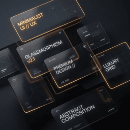
The Dark Mode Aesthetic: Prestige and Focus
Dark backgrounds are more than a trend. They:
- Project sophistication: Dark interfaces echo luxury design cues and focus attention on product content.
- Highlight accents: Bright CTAs and accent strokes pop against a dark canvas, improving conversion focus.
- Reduce visual fatigue: For technical audiences who spend long periods on screens, dark UIs can be more comfortable when implemented with correct contrast.
That said, dark mode requires careful contrast and accessibility testing: not all shades of gray provide sufficient contrast for body copy, and colors can appear differently on various displays. Always validate with contrast-checking tools and include a light-mode option when user context varies.
Why typography matters for premium branding (typographic voice and hierarchy)
Typography is your brand's visible voice. Font choice, scale, spacing, and hierarchy communicate tone before users process copy. Premium tech brands often use a two-tier approach: a distinctive display or heading font that signals authority, paired with a clean geometric sans-serif for long-form readability.
Sans-Serif vs. Serif in Tech Branding
Sans-serifs (Inter, Roboto, etc.) provide clarity and neutrality for interfaces and documentation. Modern serifs or geometric display faces add character and can elevate headings and hero statements. The goal is contrast without conflict: headings should command attention, body text should disappear into easy reading.
Hierarchy, Spacing, and Scale
Good typographic systems use scale and spacing to guide attention:
- Scale: Distinct size steps for H1, H2, H3, body, and captions create predictable scanning patterns.
- Tracking and kerning: Tight tracking on large display headings reads cohesive; more open tracking on uppercase labels feels premium and technical.
- Line-height: Generous line-height improves legibility for body copy; tighter line-height on multi-line headings can create a dense, impactful look when carefully controlled.
How color and typography work together to create a premium feel
Color defines mood; type delivers personality. Together they build trust and clarify action:
- Use a dark neutral canvas to show depth and space.
- Choose one vibrant accent (e.g., cyan) for primary actions and micro-interactions.
- Reserve a warm accent (amber/gold) for premium badges, awards, or bespoke service cues.
- Pair a geometric display face for headlines with a neutral sans-serif body to balance authority and readability.
Practical workflow: step-by-step implementation for tech startups
- Discovery and positioning — Define the emotional contract: do you emphasize speed, security, craftsmanship, or developer ergonomics?
- Palette and toneboard — Create a minimal palette: primary neutral(s), one primary accent, one warm accent, and utility colors (success/error/neutral).
- Typographic system — Select a display family for headings and a readable sans-serif for body; establish scale, weights, and responsive sizes.
- Component design — Apply colors and type to components (buttons, cards, modals) with clear rules for state and spacing.
- Accessibility pass — Test contrast, font sizes, focus states, and keyboard navigation; iterate until accessible.
- Documentation — Publish a lightweight design system documenting tokens, components, and usage examples for engineering handoff.
- Front-end implementation — Optimize webfonts, CSS variables for tokens, and prefer SVG/icon systems for crisp accents in dark mode.
- Test and iterate — Run usability checks with representative users and refine based on qualitative feedback.
Checklist: brand architecture, accessibility, and UI considerations
- Brand architecture: defined palette tokens, type scale, and usage rules for hero vs product pages.
- Accessibility: WCAG contrast checks, readable font-size baseline, keyboard and screen-reader behavior.
- Performance: minimized webfont weights, subset fonts where possible, compressed assets for dark backgrounds.
- Responsive behavior: typography and color scales that adapt for mobile and high-density displays.
- Localization: ensure chosen typefaces support target character sets and line-wrap behaviors.
Example: a short design workflow (fictional startup)
Example: LumenAPI (fictional) — an early-stage developer platform needing premium positioning.
- Positioning choice: "reliable infrastructure, designed for experts" → dark neutral canvas + cyan accent for technical confidence.
- Typeface pairing: a condensed geometric display for hero statements and Inter for body copy to keep docs readable.
- Design system: created tokens for neutral-900 (background), neutral-200 (muted surfaces), cyan-500 (primary CTA), amber-300 (premium badges).
- Implementation: developers used CSS variables and a single variable font file with dynamic weight axes to reduce requests and preserve visual rhythm in both light and dark modes.
This example demonstrates a repeatable workflow without prescribing exact colors or fonts—those choices should map to your brand strategy.
Implementation details: risks, security, performance, and limitations
- Performance: Multiple webfonts and high-resolution images can slow page load. Prefer variable fonts, subset files, and deferred font loading strategies.
- Accessibility risks: Dark themes often fail contrast checks for small text. Always validate and provide a light-mode alternative or user-controlled theme switch.
- Localization: Not all fonts support every language or script; always test typography with real content in target locales.
- Design drift: Without documented tokens and component rules, teams will introduce inconsistent color/typographic treatments over time—maintain a central design system.
- Security: Visual design choices do not materially affect application security, but performance trade-offs can indirectly affect perceived reliability. Coordinate with engineering on asset delivery and caching.
Cost and timeline considerations for teams (what to expect)
Costs and timelines vary with scope and product maturity. Instead of hard figures, plan by phases:
- Discovery & strategy: days to weeks—aligns positioning and visual goals.
- Design & prototyping: weeks—defines palette, type, and core components.
- Implementation & QA: weeks to months—front-end integration, accessibility testing, and documentation.
Key drivers that affect time and cost: number of platforms (web, mobile), level of design-system detail, localization breadth, and engineering bandwidth.
Best practices and common pitfalls (including dark-mode considerations)
- Best practice: start with tokens and responsive type scale; this makes cross-platform consistency manageable.
- Best practice: limit accent colors to one primary and one secondary; use state semantics for actions.
- Pitfall: using too many display fonts—keeps load times high and brand voice noisy.
- Pitfall: dark mode by simply inverting colors—leads to poor contrast and washed accents. Design dark theme intentionally.
- Pitfall: neglecting small UI text contrast—small labels must meet higher contrast thresholds for accessibility.
Related services and resources
If you want hands-on help building a coherent design system, see our UI/UX and branding services. To review how these principles have been applied in projects, browse our portfolio at Wizora Studio work. Ready to start? Contact our team for a tailored review at Contact.
Frequently asked questions
- How does this approach work across product and marketing? Use a single token system that maps palette and typography to components for both marketing pages and product UI; keep marketing headlines expressive while product copy remains utilitarian.
- What are the benefits? Faster trust-building with visitors, clearer CTAs, and more consistent presentation across touchpoints—leading to higher perceived quality from founders and investors.
- What are the risks? Poor accessibility or performance trade-offs if palettes and fonts are chosen without testing and optimization.
- How to use it in dark mode? Design dark mode intentionally: choose neutral ramps that maintain contrast and adjust accent saturation so colors retain legibility.
Conclusion: The Psychology of Color and Typography in Premium Branding for Tech Startups is a strategic lever—when applied with discipline it clarifies your product’s value and builds instant credibility. If you want a practical, documented design system tailored to your product and users, our team can help translate positioning into color, type, and components. Contact us to start with a brand audit and UI review.
Author: Wizora Studio — Updated: August 26, 2026. Sources: internal design research, industry conventions, and best-practice accessibility guidance used in Wizora Studio projects.