Quick answer: Wizora’s Design Language: Crafting High-Converting, Premium Dark Interfaces is a practical framework for building dark-themed products that look premium, read well, and drive conversion. This article is for product managers, founders, and designers planning or evaluating a dark UI for a SaaS product, creative brand, or tech platform.
By Wizora Studio design team — Updated 2026-08-26
Summary: What Wizora’s Design Language is and why it matters
Wizora’s Design Language: Crafting High-Converting, Premium Dark Interfaces is our internal, repeatable approach to designing dark interfaces that balance aesthetics, usability, and conversion. Dark themes are now a visual signal of sophistication when executed correctly — but they can easily degrade readability and conversion when done poorly. Our language reduces that risk by combining color science, layered depth, curated accents, and typographic discipline so teams ship interfaces that feel premium and perform.
Wizora’s Four Pillars of Premium Dark Design
Below is the structural framework our designers use as guardrails for every dark product.
1. Never use pure black for backgrounds
Pure black creates jarring contrast against white text. Instead we use deep slate, charcoal, or dark indigo tones with subtle warm or cool undertones (for example, a very low-light HSL value). These near-black canvases reduce perceived glare, improve legibility, and make accents feel richer.
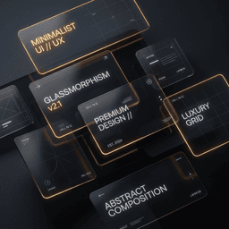
2. Build depth with glassmorphism and elevation
Shadows are less visible on dark surfaces, so we rely on layered translucency and thin separations to communicate hierarchy:
- Frosted layers — semi-transparent card surfaces with backdrop blur to distinguish content from the base canvas.
- Delicate borders — very low-opacity borders to separate interactive zones without harsh lines.
- Ambient glows — soft, blurred color forms behind sections to suggest light source and dimensionality.
3. Curated accent gradients (gold & emerald glow)
Accent choices guide attention. Our signature palette uses warm metallics and restrained jewel tones — metallic golds and bronzes for premium highlights, emerald for success and trust signals. Accents are used sparingly on CTAs, badges, and key visuals to preserve their impact.
4. Premium, high-contrast typography
Typography in a dark interface must be clear and composed. We pair a modern display face for headings with a highly legible UI text face for body copy, tune letter spacing for the scale, and set conservative line heights to maximize scannability and reading comfort.
Practical workflow: from research to production
A pragmatic, step-by-step workflow prevents common dark-mode mistakes and speeds delivery.
- Discovery & research — gather brand constraints, user tasks, and accessibility requirements; audit existing product visuals.
- Foundations — define core tokens: background scale, surface opacities, primary/secondary accents, semantic colors (success, error, info) and typography scales.
- Component mockups — design key components (nav, cards, forms, modals) with real content and edge-case states visible in dark tone.
- Prototype & test — interactive prototype for usability testing and contrast checks across devices and lighting conditions.
- Design system handoff — export tokens, usage rules, and production-ready assets; include CSS variables and example components.
- Iterate in code — review implemented UI against the prototype, tune micro-interactions, and run accessibility tests before launch.
Implementation & architecture considerations
- Design tokens — centralize colors, opacities, radii, and spacing as tokens or CSS variables to ensure consistent theming and simpler dark/light toggles.
- Component theming — implement components with semantic color roles (surface, text-primary, text-secondary, accent) so theme changes propagate safely.
- Performance — use compressed, subset fonts and optimized images; avoid heavy real-time blurs on low-end devices by providing fallback styles.
- Progressive enhancement — ensure content remains readable if CSS variables fail or scripts are blocked; fallback to sensible contrast pairs.
- Cross-platform parity — test and adapt shadows, glows, and blur on mobile and desktop; mobile GPUs may render blurs differently.
Examples and case highlights
We apply this language across SaaS dashboards, marketing sites, and design-led product experiences. See examples and featured work in our portfolio to understand how these pillars translate into live products: featured case studies. For dedicated UI/UX engagements, our service page explains scope and deliverables: UI/UX design services.
Checklist for deploying premium dark interfaces
- Define base background tones (avoid pure #000).
- Establish surface and elevation rules (transparency, blur, border opacity).
- Limit accent palette to 2–3 curated colors; assign semantic roles.
- Test all text for WCAG AA contrast at expected font sizes; adjust where needed.
- Validate interactive states (hover, focus, disabled) for visibility and accessibility.
- Include image alt text and verify all illustrations/readouts are legible on dark canvas.
- Provide a clear light/dark toggle or respect OS-level preferences.
Security, performance, and accessibility considerations
- Accessibility — dark themes must meet contrast requirements; design for keyboard focus states and reduced motion preferences.
- Performance — avoid excessive layered blurs and giant background gradients; use static fallbacks and hardware-friendly CSS.
- Security — visual design choices do not alter security posture, but avoid revealing sensitive data through decorative elements and ensure images served securely.
- SEO & technical checks — make sure server-rendered text is present, canonical tags and sitemaps are intact, and semantic HTML is used for content and headings.
Costs, timelines, and engagement models
Project scope varies by product stage. Typical engagement patterns we use:
- Design audit & recommendations — short engagements to assess fit and provide an action plan.
- Design system + component library — multi-week projects to define tokens, components, and handoff artifacts for dev teams.
- End-to-end product design — full-scope delivery including research, UX flows, visual design, and implementation support.
For a tailored estimate and timeline, contact our team so we can scope against your product and constraints: Contact.
Limitations, risks, and when dark interfaces aren’t right
Dark interfaces are not universally optimal. Consider avoiding or limiting dark themes when:
- Your audience relies on small, high-density text (e.g., legal transcripts) that requires maximum readability under varied lighting.
- Brand guidelines prioritize a bright, minimalist identity where dark tones would conflict.
- There are strict contrast or accessibility requirements that are easier to meet with light backgrounds for specific content types.
When in doubt, prototype and test with real users and devices. Many brands adopt hybrid approaches: dark for marketing showcase pages and light for dense documentation or admin UIs.
How design translates to business results
Design influences perception, trust, and user behavior. A premium dark interface can:
- Increase perceived product value and differentiation in competitive markets.
- Improve engagement when visual hierarchy and readability support user goals.
- Focus attention on conversion elements through restrained accent use.
These outcomes depend on execution — visual polish alone does not guarantee conversions. Usability, content strategy, and conversion-focused patterns must accompany the aesthetic.
Next steps
If you’re evaluating a dark redesign, start with a focused audit or prototype. Explore our UI/UX services to see how we structure these engagements: UI/UX design services. To discuss a specific product or request a free scoping conversation, reach out: Contact.
Frequently asked questions
- How does Wizora’s Design Language work for existing products? — We begin with an audit, create a tokenized palette, and then incrementally replace components to preserve stability while improving the visual system.
- How to use this design language? — Adopt the four pillars as rules: choose a near-black base, layer surfaces, reserve accents, and set typographic scales. Convert those rules into tokens and components for implementation.
- Why do dark interfaces build stronger brands? — When well-executed, dark themes create perceived depth and exclusivity that can elevate brand positioning; however, they must be balanced with usability and accessibility.