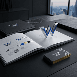
Short answer: "Beyond the Grid: Breaking Design Conventions in Modern Interfaces" describes a deliberate approach to move past predictable column systems and use intentional asymmetry, layered Z-axis composition, and controlled whitespace to create premium, memorable interfaces. This article is for product designers, UX leads, and cross-functional teams considering a visual refresh or a new design system that needs character without sacrificing usability.
By Wizora Studio Design Team — Updated 2026-08-26. For examples of these principles in live projects, see our portfolio and explore our UI/UX design services.
Summary: What "Beyond the Grid" means and who this article is for
Grids deliver order and predictability. Going beyond the grid doesn't mean abandoning structure — it means using structure as a scaffold while introducing deliberate offsets, layered depth, and negative space to direct attention and convey brand value. If your goal is a distinct product surface that feels premium and usable, this guide explains the why, the how, and the risks to consider.
1. The Art of Intentional Asymmetry
Asymmetry is a design decision that generates visual tension and a clear focal point. It slows scanning, increases memorability, and gives interfaces a contemporary editorial quality. Key tactics include:
- Offsetting hero content (text and imagery don't share a 50/50 split).
- Using oversized type or microcopy that partially sits outside the baseline grid.
- Balancing an off-center visual with deliberate whitespace or a small anchor element on the opposite side.
Intentional asymmetry should always communicate hierarchy. If an element is offset, ensure its importance merits the attention and provide clear visual anchors so users understand relationships between components.
2. Layering and Depth: The Z-Axis
Layering transforms flat blocks into perceived physical space. Techniques we use:
- Frosted glass panels: semi-transparent cards with subtle blur to separate content without hard borders.
- Overlapping assets: product mockups or illustrations that overlap container edges to imply scale.
- Multi-stop shadows: layered, soft shadows to articulate elevation instead of a single hard drop-shadow.
Keep interactions predictable: overlapping should not hide interactive targets or break reading order. Use layering to help, not hinder, discoverability.
3. Embracing Whitespace as an Element
Whitespace is a strategic tool that elevates content. Generous margins and breathing room make elements feel important and improve comprehension. When using whitespace:
- Prioritize one focal element per view (headline, CTA, or product visual).
- Use modular spacing tokens in your design system so whitespace is intentional and consistent.
- Allow whitespace to change responsively — what reads as generous on desktop should compress thoughtfully on mobile.
Practical workflow: How to apply asymmetric layouts (step-by-step example)
Example: redesigning a SaaS product hero with an asymmetric layout.
- Define goals: clarify the primary action (signup, demo) and the emotional tone (trustworthy, premium).
- Sketch and wireframe: rough asymmetric compositions — off-center text, overlapping device mockup, large headline with whitespace.
- Componentize in Figma: create responsive components, spacing tokens, and variants that support offsets (left, right, centered).
- Prototype & test: create an interactive prototype and run quick usability tests to confirm focal clarity and CTA discoverability.
- Dev handoff: export design tokens, provide responsive breakpoints, and include CSS examples for overlap behavior.
- Implement & QA: verify stacking order, keyboard focus, touch targets, and cross-device rendering.
- Measure: monitor click-through and engagement to ensure the creative approach meets business goals.
Implementation guidance: tools, architecture and workflow
Tools we commonly use:
- Design & prototyping: Figma (components, auto-layout), interactive prototypes for early testing.
- Developer collaboration: Storybook for isolated components, design tokens exported to CSS variables.
- Front-end stack: CSS Grid & Flexbox for layout baseline; transforms (translate) and negative margins for controlled overlap; SVG assets for crisp scaling.
Performance and maintainability tips:
- Use composited properties (transform, opacity) for animations to reduce repaints.
- Prefer CSS shadows and layered box-shadows over large raster images to keep payload small.
- Lazy-load off-screen visuals and use responsive image formats (WebP/AVIF) to reduce bandwidth.
- Document spacing tokens and z-index scale in a shared design system to avoid ad hoc stacking conflicts.
Best practices and checklist for designers
- Start with hierarchy and goals — asymmetry must serve function.
- Build responsive variants; test on narrow and large viewports.
- Keep interactive targets obvious — offsets cannot reduce discoverability.
- Maintain consistent spacing tokens and type scales.
- Include accessibility checks early (contrast, focus order, ARIA where needed).
- Define a z-index system and document it to prevent stacking bugs.
- Run prototypes with users to validate cognitive load and eye flow.
- Ensure images and assets have descriptive alt text and semantic markup.
Examples and case studies
Asymmetric layouts work well across categories: product landing pages that need a premium feel, editorial sites seeking an immersive read, and design systems that require distinctive component states. For visual examples and project outcomes, browse our portfolio and learn how we integrate these principles into larger design systems through our UI/UX design engagements.
Risks, limitations and security / performance considerations
Breaking the grid introduces risks if not managed:
- Accessibility: Poorly executed overlaps or visual-only cues can harm screen reader or keyboard users. Always preserve DOM order and provide clear focus states.
- Performance: Excessive layering, large raster assets, or heavy animations can increase paint cost and reduce perceived performance.
- Responsive constraints: What reads as elegant on desktop can feel cramped on mobile. Plan scaled-down variants rather than forcing the same composition.
- Maintenance: Custom offsets and exceptions can complicate future edits. Use tokens and component variants to keep the system maintainable.
Cost and timeline considerations for teams
Effort depends on scope and existing systems. Small experiments or landing pages can be prototyped quickly; integrating asymmetric patterns into a large product or design system requires alignment across product, design, and engineering and takes more coordination. Key drivers of cost and time include the number of responsive breakpoints, animation complexity, and the need for accessibility remediation or performance optimization.
Accessibility and responsive design considerations
Designing beyond the grid must respect inclusive principles:
- Maintain logical reading order in the DOM even if visual positions vary.
- Ensure sufficient contrast for layered foregrounds on top of semi-transparent panels.
- Provide visible focus styles and large enough touch targets.
- Respect user preferences (prefers-reduced-motion) for animated transitions.
- Test with assistive technologies and on real devices to validate the experience.
Technical SEO and implementation checklist
- Ensure page titles, meta descriptions, and canonical tags are rendered server-side where possible.
- Include semantic HTML and meaningful headings to preserve crawlability.
- Provide descriptive image alt text for critical visuals and avoid decorative images that carry information without alt descriptions.
- Use structured data where relevant and keep important text server-rendered to prevent indexing issues.
- Validate that large visual assets are optimized and that layout shifts are minimized to protect Core Web Vitals.
FAQs
Q: How does "Beyond the Grid" affect usability?
Intentional asymmetry can improve attention and memorability, but it must preserve hierarchy and discoverability. Usability testing early in the process prevents confusing layouts.
Q: Will asymmetric layouts break on small screens?
Not if you design responsive variants. Often the asymmetric composition collapses into a stacked layout that preserves priority while losing decorative offsets on narrow viewports.
Q: Can this approach fit into a design system?
Yes — by creating component variants, spacing tokens, and a documented z-index system, asymmetric patterns become repeatable and maintainable.
Conclusion: When to engage a UI/UX or product design team and next steps
Use "Beyond the Grid" approaches when your product needs a stronger brand voice, higher perceived value, or improved engagement. If you’re planning a redesign or want a technical audit of asymmetric patterns in your product, our UI/UX design team can run a focused audit and prototype to validate ideas. View examples in our portfolio, or contact us to discuss a design audit and next steps.