By Wizora Studio — Updated 2026-08-26
The Evolution of Glassmorphic UI: Frosted Glass Elements in B2B SaaS Layouts
Quick answer: For product teams, designers, and frontend engineers building B2B SaaS, modern glassmorphic UI — when treated as a layered organization system rather than mere decoration — creates premium, legible, and context-rich interfaces. The trade-offs are accessibility and performance risks that require deliberate fallbacks and optimizations. This article explains what glassmorphism is, when it helps, how to implement it practically, and a checklist for safe adoption.
What is glassmorphic UI and the frosted-glass effect
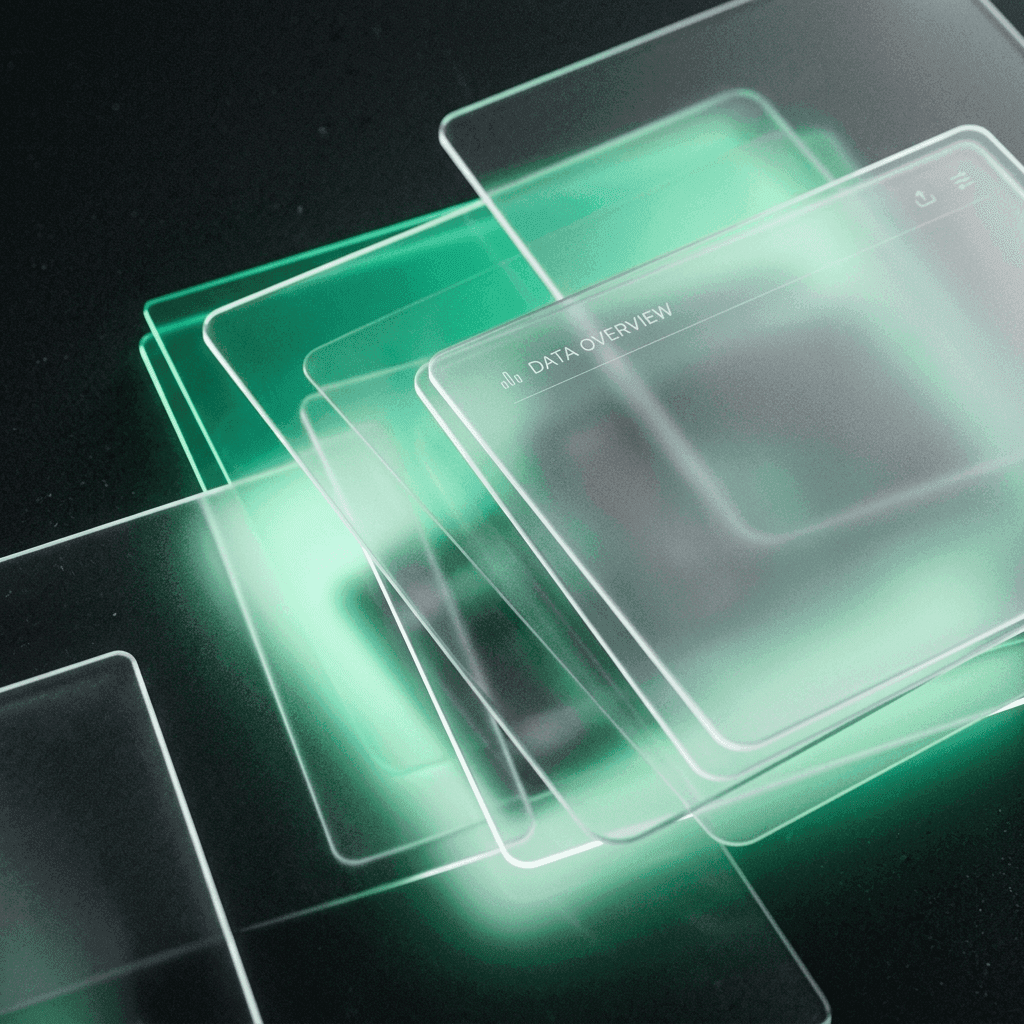
Glassmorphism is a visual language that places semi-transparent, blurred panels over content so background colors and shapes remain perceptible through a “frosted” surface. Early glassmorphism favored bright gradients and strong blur; the evolved approach used in B2B SaaS is subtler, focused on depth, tactile edges, and improved contrast so panels communicate structure without distracting from data.
Why glassmorphism matters for B2B SaaS interfaces
In data-dense applications, visual weight and hierarchy are crucial. Glassmorphic panels provide:
- Depth without hard lines: layered surfaces separate information while preserving context.
- Perceived premium quality: soft reflections and subtle borders make interfaces feel polished.
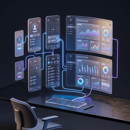
- Context retention: users can see underlying charts or maps faintly through panels, helping spatial awareness in dashboards.
1. Visual organization without borders — practical uses
Use frosted panels to group related controls, emphasize a reading pane, or separate floating widgets. Instead of adding more solid backgrounds or thick dividers, glass panels create a continuum of information layers. Practical examples:
- Side panels that hover above a data grid, showing filters without breaking the grid’s visual flow.
- Modal previews where the underlying report remains slightly visible to keep users oriented.
- Header cards with subtle reflections to indicate lift and interactivity.
2. The formula for premium glass CSS (design and code notes)
Modern glassmorphism balances three core properties: background opacity, backdrop blur, and a fine border highlight. Our typical Tailwind-style card in dark mode uses a balanced combination of low-opacity background, backdrop blur, and a faint border to simulate glass edges. Example class string we use in production: className="bg-neutral-950/70 backdrop-blur-md border border-white/[0.08] shadow-[0_8px_32px_0_rgba(0,0,0,0.37)]".
- Avoid pure white borders: low opacity (around 8–10%) reads like reflected light instead of a drawn line.
- Add subtle noise: a very low-opacity grain overlay prevents the panel from looking like a flat blur on large monitors.
- Dampen background tint: increase background tint for small text to preserve legibility.
- Motion and micro-interactions: animate elevation and blur subtly on hover; respect prefers-reduced-motion.
3. The accessibility barrier and mitigation strategies
Glass effects can reduce contrast and make small text illegible for users with low contrast sensitivity. Mitigation strategies:
- Never overlay small body text directly on a bright, busy blurred gradient. Reserve titles and large numbers only when contrast is guaranteed.
- Provide a solid-color fallback for browsers that lack support for backdrop-filter. Feature-detect via CSS or server-rendered classes and use the solid fallback as the visual baseline.
- Ensure WCAG 2.1 AA contrast ratios (minimum 4.5:1 for body text) between text and the effective background. Where not possible, increase font size and weight.
- Respect accessibility preferences: implement prefers-reduced-motion to reduce blur/animation and ensure keyboard focus indicators remain high-contrast and visible on glass surfaces.
- Use ARIA roles and clear labels so content remains navigable for screen readers even when visual effects are present.
Practical workflow and example implementation (step-by-step)
Below is a pragmatic approach for shipping glassmorphic UI in a Next.js/React/TypeScript + Tailwind stack. Adjust for your framework similarly.
- Design iteration: create high-fidelity mocks with multiple contrast states (light, dark, and fallback). Include noise texture and border treatment as separate layers.
- Component API: build a reusable Card component that accepts props: blurLevel, tint, noiseToggle, elevated. Keep logic for fallbacks inside the component.
- Feature detection: at build-time or runtime, detect CSS support for backdrop-filter. If unsupported, use a solid fallback class (e.g., bg-neutral-900/95).
- Implementation example (conceptual): render a container with the glass classes for supported browsers and an explicit fallback variant for others. Animate elevation with transform and box-shadow rather than toggling blur intensity aggressively.
- Performance checks: test on mid-range mobile devices. Use Chrome DevTools to measure layout paints and GPU composition; ensure paint size is limited and avoid large translucent layers stacking.
- Accessibility testing: run automated contrast checks, keyboard-only navigation, and manual screen reader verification.
- Release with feature flags: roll out glass UI to a small user segment, collect metrics on page rendering times and support requests, then iterate.
Checklist for adopting glassmorphic UI in a SaaS product
- Define the UI goal: hierarchy, emphasis, or brand premiumization?
- Design light and dark variants, plus a solid fallback.
- Implement a shared GlassCard component with props for blur and tint.
- Feature-detect backdrop-filter and add solid fallbacks.
- Automated contrast tests and manual accessibility verification.
- Performance testing on representative devices (mobile and desktop).
- Prefer subtle motion and support prefers-reduced-motion.
- Document component usage in your design system and include accessibility notes.
Risks, security and performance considerations
Glassmorphic effects are primarily a frontend concern but interact with overall product quality:
- Rendering cost: backdrop blur can increase paint and composite workload; multiple large translucent layers stack costlier than solid panels.
- Battery and thermal impact: heavy blur and large shadow layers can reduce battery life on mobile devices — test on mid-range hardware.
- Security: visual effects do not introduce direct security vulnerabilities, but any client-side layering that reveals underlying sensitive data (e.g., blurred text) must be treated carefully — avoid exposing sensitive content through translucent layers.
- Browser support: not all browsers and older devices support backdrop-filter — always provide a predictable fallback to avoid broken layouts.
Related tools and technical integrations
Glass UI integrates smoothly with modern stacks. If you're building with Next.js, React, or TypeScript, encapsulate glass behavior in typed components and style via utility-first frameworks like Tailwind. Wizora offers full-stack design and engineering for SaaS UI, including frontend development and component libraries — see our web development and AI & SaaS development pages for implementation services, and our UI/UX services for design system support.
Cost, timeline and when to hire help
Adopting glassmorphism is straightforward for isolated components but grows in scope as you extend it across an app. Hire external help when:
- Your product requires consistent accessibility compliance across many pages.
- Performance budgets are tight and you need engineering for optimizations and testing across device families.
- You want a design-system-grade implementation that scales with your product.
For implementation assistance, component libraries, or an audit of your current UI, contact Wizora Studio via Contact or review our work in the portfolio.
FAQ
-
How does modern glassmorphism work?
It layers a semi-opaque panel over content, applies a backdrop blur to the underlying layer, and adds a faint border and noise texture. The visual result preserves context while creating a distinct surface for controls or content.
-
How should I use glassmorphism in dashboards?
Use it for floating panels, modals, and supplementary cards where context retention matters. Avoid using it beneath dense tables of small text unless you can guarantee high contrast.
-
What are the main limitations and risks?
Main limitations are reduced text contrast for some users and extra rendering cost on lower-end devices. Mitigate these with solid fallbacks, contrast testing, and limited blur area.
Glassmorphic UI can elevate SaaS interfaces when used with intent: as a tool for visual organization and premium perception instead of a mere trend. If you want a technical audit, component implementation, or design-system integration, start a conversation with our team at Contact or explore our web development and UI/UX offerings.